# CSS General recalls
1. inline block vs block vs inline
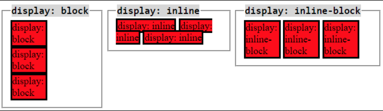
inline block:
- respect
top bottom left rightmargin and paddings
inline:
- respect
right and leftmargins and paddings, not allow top and bottom margins - not allow to set width and height
block:
- respect
top bottom left rightmargin and paddings - force line break
- acquires full width if width is not defined
Visual comparison:
2. CSS Grid layout Examples
Example 1:
<!DOCTYPE html>
<html lang="en">
<head>
  <meta charset="UTF-8">
  <meta http-equiv="X-UA-Compatible" content="IE=edge">
  <meta name="viewport" content="width=device-width, initial-scale=1.0">
  <title>CSS Grid Layout Example 1</title>
  <style>
    .container {
      display: grid;
      grid-gap: 20px;
      height: 100vh;
      grid-template-columns: 100px 200px auto auto;
    }

    .grid-item {
      background-color: skyblue;
    }

    .grid-item:nth-of-type(2) {
      grid-row-start: span 2; /* extended 2 rows */
    }

    .grid-item:nth-of-type(6) {
      /* grid-column-start: 3; */
      /* grid-column-end: 5; */ /* first version */
      /* grid-column-end: span 2; */

      grid-column: 3 / span 2; /* shortcut expression */
    }
  </style>
</head>
<body>
  <div class="container">
    <div class="grid-item">1</div>
    <div class="grid-item">2</div>
    <div class="grid-item">3</div>
    <div class="grid-item">4</div>
    <div class="grid-item">5</div>
    <div class="grid-item">6</div>
  </div>
</body>
</html>
Example 2
<!DOCTYPE html>
<html lang="en">
<head>
  <meta charset="UTF-8">
  <meta http-equiv="X-UA-Compatible" content="IE=edge">
  <meta name="viewport" content="width=device-width, initial-scale=1.0">
  <title>CSS Grid Layout Example 2</title>
  <style>
    .container {
      display: grid;
      grid-gap: 5px;
      grid-template-areas:
        "header"
        "section"
        "aside-1"
        "aside-2"
        "footer";
    }

    .container > * {
      background-color: mediumseagreen;
      font-size: 80px;
    }

    header {
      grid-area: header;
    }

    section {
      grid-area: section;
    }

    aside:nth-of-type(1) {
      grid-area: aside-1;
    }

    aside:nth-of-type(2) {
      grid-area: aside-2;
    }

    footer {
      grid-area: footer;
    }

    /* for larger screens */
    @media (min-width: 700px) {
      .container {
        grid-template-areas:
          "header header header"
          "aside-1 section aside-2"
          "footer footer footer";
      }
    }
  </style>
</head>
<body>
  <div class="container">
    <header>
      Header
    </header>
    <aside>
      Aside 1
    </aside>
    <section>
      Section
    </section>
    <aside>
      Aside 2
    </aside>
    <footer>
      Footer
    </footer>
  </div>
</body>
</html>
3. CSS Position recalls
<!DOCTYPE html>
<html lang="en">
<head>
  <meta charset="UTF-8">
  <meta name="viewport" content="width=device-width, initial-scale=1.0">
  <title>CSS Position Recall</title>
  <style>
    html, body {
      height: 100%;
      margin: 0;
      padding: 0;
    }

    .parent {
      padding: 5px;
      background-color: #00AAFF;
    }

    .child {
      padding: 5px;
    }

    .child-one {
      background-color: rgb(116, 255, 116);
    }

    .child-two {
      background-color: rgb(248, 117, 117);
    }

    .child-three {
      background-color: rgb(255, 116, 232);
    }

    .parent {
      position: relative;
      height: 100%;
    }

    .child {

    }

    .child-one {
      width: 20%;
      position: fixed;
      right: 0;
    }

    .child-two {
      position: absolute;
      width: 70%;
      top: 50%;
    }

    .child-three {
      width: 200px;
      position: sticky;
      top: 100%;
      bottom: 0;
      left: 50%;
      right: 50%;
      transform: translate(-50%, -50%);
    }
  </style>
</head>
<body>
  <div class="parent">
    Parent
    <div class="child-one child">
      One
    </div>
    <div class="child-two child">
      Two
    </div>
    <div class="child-three child">
      Three
    </div>
    <!-- static: default position -->
    <!--
      relative: very similar with static positioning
      diff between static and relative position:
      relative allows developer to change top left bottom and right element, static no allowed
     -->
     <!-- absolute:
      you want to set element into specific position, and never want other elements to change any position (stay where they are)
      Common usage: set parent as relative element, and child as absolute element, so define element position specifically
    -->
    <!-- fixed:
      always fixed the element based on entire HTML DOM (webpage screen), nothing to do with parents or children
      fixed position, after scroll, element stays where it was, if using absolute, then position will be moving based on parent element
    -->
    <!-- sticky:
      (relative + fixed = sticky) position
      example: sticky footer, when scroll, always make footer at bottom without changing position
    -->
  </div>
</body>
</html>
4. CSS Practical Example: CSS scroll images effect
Demo:
<!DOCTYPE html>
<html lang="en">
  <head>
    <meta charset="UTF-8">
    <meta http-equiv="X-UA-Compatible" content="IE=edge">
    <meta name="viewport" content="width=device-width, initial-scale=1.0">
    <title>CSS Tricks Examples 04 - dynamic size elements</title>
    <style>
      /* this is another way to make element centered !!!! */
      /* .Box {
        height: 50vh;
        width: 50vw;
        margin: 25vh 25vw;
        background-color: slategray;
      }

      body {
        margin: 0;
        padding: 0;
      }

      p {
        padding: 2rem 0 0 2rem;
        font-family: monospace;
        font-size: 2rem;
        color: antiquewhite;
      } */

      /* Custom CSS making dynamic element size !!! */
      body {
        margin: 0;
        font-family: monospace;
      }

      p {
        margin: 0;
        font-size: 2rem;
        padding: 0 5rem;
        text-shadow: 1px 1px #333;
        color: white;
      }

      section {
        width: 100vw;
        height: 100vh;

        /* layout for: content inside */
        display: flex;
        justify-content: center;
        align-items: center;

        /* adding some background images: colorful one */
        background-size: cover;
        background-repeat: no-repeat;
        background-attachment: fixed; /* background-attachment: used for setting whether a background image scrolls with the rest of the page, or is fixed */
      }

      section:nth-of-type(1) {
        background-image: url('https://i.picsum.photos/id/1000/5626/3635.jpg?hmac=qWh065Fr_M8Oa3sNsdDL8ngWXv2Jb-EE49ZIn6c0P-g');
      }
      section:nth-of-type(2) {
        background-image: url('https://i.picsum.photos/id/1005/5760/3840.jpg?hmac=2acSJCOwz9q_dKtDZdSB-OIK1HUcwBeXco_RMMTUgfY');
      }
      section:nth-of-type(3) {
        background-image: url('https://i.picsum.photos/id/1024/1920/1280.jpg?hmac=-PIpG7j_fRwN8Qtfnsc3M8-kC3yb0XYOBfVzlPSuVII');
      }
      section:nth-of-type(4) {
        background-image: url('https://i.picsum.photos/id/103/2592/1936.jpg?hmac=aC1FT3vX9bCVMIT-KXjHLhP6vImAcsyGCH49vVkAjPQ');
      }

    </style>
  </head>

  <body>
    <!-- <div class="Box">
      <p>This is my content</p>
    </div> -->
    <section>
      <p>This is the first paragraph, here is the text as you can see which is shown up now !!!!</p>
    </section>

    <section>
      <p>This example is for making scroll-able background text and you can scroll each section</p>
    </section>

    <section>
      <p>After scrolled, you will see different background images and photos and also texts, woohooo</p>
    </section>

    <section>
      <p>The last paragraph and pleas remember how to do this next time then ~~~~~</p>
    </section>
  </body>
</html>
5. Example of grid-column && grid-row-start:
<!DOCTYPE html>
<html lang="en">
<head>
  <meta charset="UTF-8">
  <meta http-equiv="X-UA-Compatible" content="IE=edge">
  <meta name="viewport" content="width=device-width, initial-scale=1.0">
  <title>CSS Grid Layout Example 2</title>
  <style>
    .container {
      display: grid;
      grid-gap: 20px;
      height: 100vh;
      grid-template-columns: 100px 200px auto auto;
    }

    .grid-item {
      background-color: skyblue;
    }

    .grid-item:nth-of-type(2) {
      grid-row-start: span 2; /* extended 2 rows */
    }

    .grid-item:nth-of-type(6) {
      /* grid-column-start: 3; */
      /* grid-column-end: 5; */ /* first version */
      /* grid-column-end: span 2; */

      grid-column: 3 / span 2; /* shortcut expression */
    }
  </style>
</head>
<body>
  <div class="container">
    <div class="grid-item">1</div>
    <div class="grid-item">2</div>
    <div class="grid-item">3</div>
    <div class="grid-item">4</div>
    <div class="grid-item">5</div>
    <div class="grid-item">6</div>
  </div>
</body>
</html>
6. CSS float property
float: used for positioning an element,
Attentions:
- absolutely positioned elements ignore the float property
- after using the float, the rest of the elements will flow around the floating element, to avoid
flow around it, we can use clear (clear: both;) property to fix the display issue.
- after using the float, the rest of the elements will flow around the floating element, to avoid
Example: here
7. CSS common properties
1). user-select: make element is unselectable,
Example: make element unable to be selected
2). clip-path: make an avatar profile image,
Example: circle an image
3). transition property (for make element animation), it stands for:
- transition property, eg: width
- transition duration, eg: 1s
- transition timing function, eg: linear
- transition delay, eg: wait for 2 seconds to trigger transition effect
Example: extend input field width when focus
4). letter-spacing: increase or decrease the space between characters in text
5). display properties:
block: take entire row to display, like 100% width, div default display block
inline: take as minimum space as possible, (don’t have width and height settings), span default display inline
inline-block: same as inline element, and you can set width and height for that specific inline-block element !!!
6). CSS units: em, rem
Both em and rem are relative to the font size you have defined
Em: relative to its parent font size !!! Rem: R for root, relative to the root element font size !!!
7). whites-space in css:
Specify how the white space inside element get handled
eg: nowrap: text will never wrap to the next line, always continue with the same line until br tag occurs.
8).